
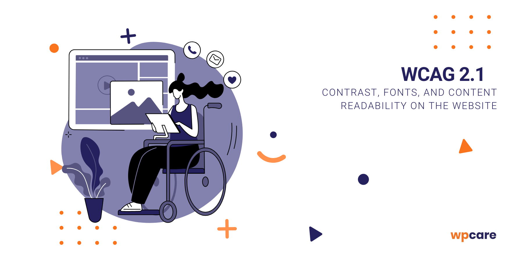
Too little color contrast, poorly chosen fonts, or lack of content readability can effectively discourage users from engaging with your website – and not only people with disabilities. The WCAG 2.1 standard clearly defines the rules for contrast, typography, and interface design that must be implemented to ensure a site is accessible and user-friendly for everyone.
In this article, we’ll show you how to take care of colors, fonts, forms, and graphic elements so that your website meets WCAG requirements while being more readable, functional, and effective from a business perspective.
Why readability and contrast are key to accessibility?
Contrast and readability of content are some of the basic WCAG 2.1 criteria. For people with visual impairments, seniors, or users with dyslexia, these elements determine whether they can use the site without barriers. Too light text on a light background, small font size, or insufficient line spacing cause rapid eye strain and make information harder to process.
High contrast and properly chosen fonts improve the user experience not only for people with disabilities but for everyone. Especially on mobile devices and in difficult lighting conditions. That’s why focusing on readability and color contrast is not only about meeting WCAG requirements but also about good UX, which increases time spent on the website, conversion rates, and overall visitor satisfaction.
Everywhere you hear about the need to implement WCAG, but you don’t know what it is? Check out our article:

Make Your website compliant – WCAG 2.1 becomes mandatory in 2025!
read moreContrast and WCAG – how to measure and what are the standards?
Contrast levels for WCAG AA and AAA
WCAG 2.1 guidelines clearly define minimum contrast values between text and background that ensure readability. For body text, the contrast ratio should be at least 4.5:1. Larger headings (over 18pt or 14pt bold) the acceptable ratio is 3:1. For the highest AAA compliance level, the requirements are even stricter – the contrast ratio should be 7:1.
How to check color contrast in practice
To verify whether your website meets these standards, it’s worth using free tools such as Contrast Checker, WebAIM, or built-in testers in browsers and design software (e.g., Figma, Sketch). They allow you to quickly check if your chosen colors provide sufficient visibility.
However, high contrast does not always mean black text on a white background. It’s important to choose colors consistent with your brand’s visual identity while still compliant with WCAG standards. This way, you can combine aesthetics with accessibility and usability.
Typography and WCAG
Proper typography is one of the key elements of digital accessibility. Even with correct contrast, poorly chosen fonts can make text difficult to read. According to WCAG guidelines, it is recommended to use simple sans-serif fonts without decorative elements that hinder readability. Popular choices include Arial, Verdana, or Roboto, which scale well across different devices.
Another important factor is font size. The minimum recommended size is 16px, but it is crucial that content can be enlarged up to 200% without loss of readability or functionality. Equally important are spacings. Proper line height (at least 1.5), paragraph spacing, and letter spacing make reading easier, especially for people with dyslexia or vision problems.
WCAG also highlights text alignment – avoid full justification, which creates “rivers” in the text. Instead, use left alignment. Following these rules makes typography not only WCAG-compliant but also more user-friendly and comfortable.
Colors, graphics, and icons and WCAG
Color as a supplement
Colors and graphic elements play a huge role in user experience, but under WCAG 2.1 they cannot be the sole carriers of information. This means that, for example, error messages in forms should not rely only on red color. They should also include an icon, a text message, or a border so that they are clear for everyone, including people with color blindness.
Alternative text (alt)
Images and illustrations used on a website should be high-contrast, clear, and understandable. Every visual element carrying important meaning must have alternative text (alt), which screen readers can read aloud. This is especially important for icons. They are not always obvious to all users, so they should be complemented with labels or text descriptions.
When designing, it is also worth remembering that icons and buttons should be large enough and well-spaced, which makes them easier to use for people on mobile devices and users with limited motor skills. Following these principles makes colors, graphics, and icons not only aesthetic but also fully accessible and WCAG-compliant.
Forms and buttons accessibility
Forms and buttons are among the most important interactive elements on a website – they are how users sign up for newsletters, place orders, or contact a company. WCAG 2.1 emphasizes that they must be easy to use, visible, and understandable for all.
Each form field should be clearly labeled with a
Buttons (CTAs) must have sufficient contrast against the background and clear action text, e.g., “Send”, “Buy now” instead of generic terms like “OK”. Their size and spacing are also crucial – buttons that are too small are hard to click, especially on mobile screens.
Keyboard accessibility cannot be forgotten either. Forms and buttons must have a visible focus state that shows where the cursor currently is. This allows screen reader and keyboard-only users to fully use the site’s functionality.
Tools supporting WCAG
Meeting WCAG 2.1 requirements doesn’t have to be difficult if you use the right tools. There are many free and paid solutions that help check contrast, test content readability, and analyze overall accessibility.
The most popular include:
- Contrast Checker (WebAIM) – a simple online tool for verifying color contrast against AA and AAA levels.
- WAVE Accessibility Tool – a browser extension that highlights accessibility issues on a specific page.
- Lighthouse (Google Chrome) – an automated audit tool for performance, SEO, and accessibility.
- AXE DevTools – a comprehensive developer tool for real-time accessibility testing.
- Plugins for Figma and Sketch – e.g., Stark, which helps designers check contrast and accessibility during the design phase.
It is also helpful to use ready-made WCAG checklists – available as PDFs or interactive apps – which let you systematically go through requirements and ensure that no important element is overlooked. Such tools make the process of designing and optimizing websites more structured and WCAG implementation much easier.
Summary
Taking care of contrast, typography, colors, graphics, or forms is not just about aesthetics but about meeting WCAG 2.1 requirements and creating positive user experiences. A website designed with accessibility in mind is clearer, more intuitive, and user-friendly – which benefits not only people with disabilities but also leads to better UX and higher business effectiveness.
Implementing accessibility standards doesn’t have to be hard – just use simple testing tools and follow proven design principles. Remember that a fully accessible website is an investment in a broader audience, better search engine performance, and greater trust in your brand.
thanks to a professional WCAG audit
Ensure your website complies with the latest WCAG 2.1 standards.
Our team will conduct an accessibility audit, identify issues, and provide practical recommendations that will improve the readability, usability, and SEO of your site.
Order the service


